Colours have an impact on people. Most of the meaning we give to colour is due to culture and experience.
For instance, most people learn from a young age that traffic lights have two important colours: red for stop and green for go.
Fire is red which can explain why the colours is often perceived a meaning danger or urgency.
Water and sky are blue, which may create a sense of calm.
Here is a chart created by Entrepreneur.com
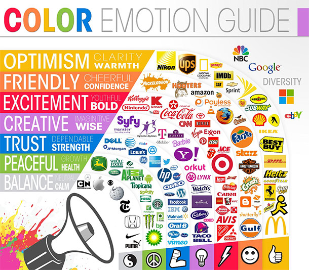
Where do you fit on the colour chart? Does it reflect your brand?